It was the best of times, it was the…well, a mediocre time. Great because I was painting. Less than great because it didn’t turn out remotely as good as I had hoped.
I am working on painting glowing light. I am a generally serious and restrained person – kind of the opposite of colorful and lighthearted. These last two years have been heavy enough without me pulling myself down any further. So this year I am focusing on joy in my life. I hope to start showing you more paintings which radiate hope and joy.
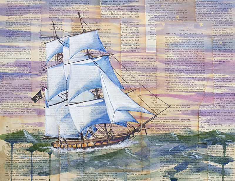
“The pessimist complains about the wind; the optimist expects it to change; the realist adjusts the sails.“
– William Arthur Ward
“I find the great thing in this world is not so much where we stand, as in what direction we are moving – we must sail sometimes with the wind and sometimes against it – but we must sail, and not drift, nor lie at anchor.“ – Oliver Wendell Holmes, Jr
These ship paintings are appropriate for my life right now. I stand on a shore on which I have built a pretty comfortable life. It is hard to leave the familiar, even if the familiar is not working any more. Some big changes are on the horizon for me and my family. Setting sail for new adventures, maybe…
“There is nothing – absolutely nothing – half so much worth doing as simply messing about in boats.“ – The Wind in the Willows, Kenneth Grahame
I have learned a lot during the era of Covid. One thing is that, although I do best actually creating my artwork in solitude, my work truly thrives when I have the opportunity to present it to others. I need that feedback which is only present in person, watching people react to and make connections through my paintings.
I have long been an advocate of visiting galleries and art museums. There is no comparison to standing in front of the actual painting only an arm’s reach away. No matter how high quality a reproduction is, it is not the real thing made by the artist and seen by your own eyes. This is such a priority to me that I have built international trips around the artwork I can experience and share with my family. Can I tell you about one of those experiences?
As a child, my mother would often read to me and my siblings about art and artists. One painting stands out in my mind (partly) for silly reasons. Primavera(Spring) by Botticelli is masterwork depicting mythological figures and is heavy with symbolism. My mom was showing me and my brother a picture of the painting in a book and pointing out different elements. She mentioned the “angel hoovering above” at which we broke into unstoppable giggles. Hoovering, not hovering. You know, cupids are not usually depicted as vacuuming the air above Venus! This was then a family joke for years. Fast forward to my first trip to Florence, Italy and The Uffizi. Wandering through halls of art and then stepping into a room with a huge, wall sized painting: Botticelli’s Primavera. I was breathless at the experience. This painting, so small in a book on my mother’s lap, is massive. I cried and laughed out loud – in public! There were certainly connections to my mom (also an artist), my childhood art appreciation (books and museums), my college art history studies (slides!) and the sheer, enveloping experience of standing in front of that painting in Florence.
I could keep going. I have been to twenty world class art galleries in half a dozen countries. I have experiences with art which are priceless and I will always cherish. I am pleased to have shared most of those experiences with my husband and now many with my children as well. I have seen art works capture the attention of my children at young ages, how they will pause and ponder over a painting. How they will bring up memories of particular paintings they have seen in galleries, how they feel about them, how something else they are experiencing makes them feel and reminds them of the painting.
We humans are made to experience with our senses. The digital world will never eclipse real experiences. Twitter is inferior to books. Virtual is less ideal than physical. People need people. The introvert that I am has been hit a little too hard with that lesson this past year and a half (going on two).
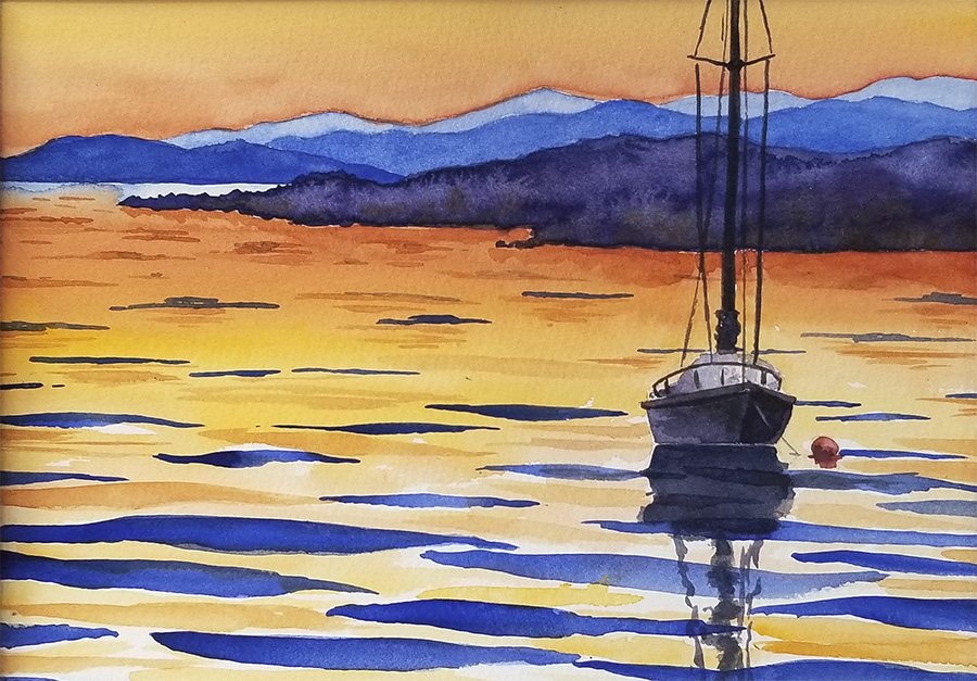
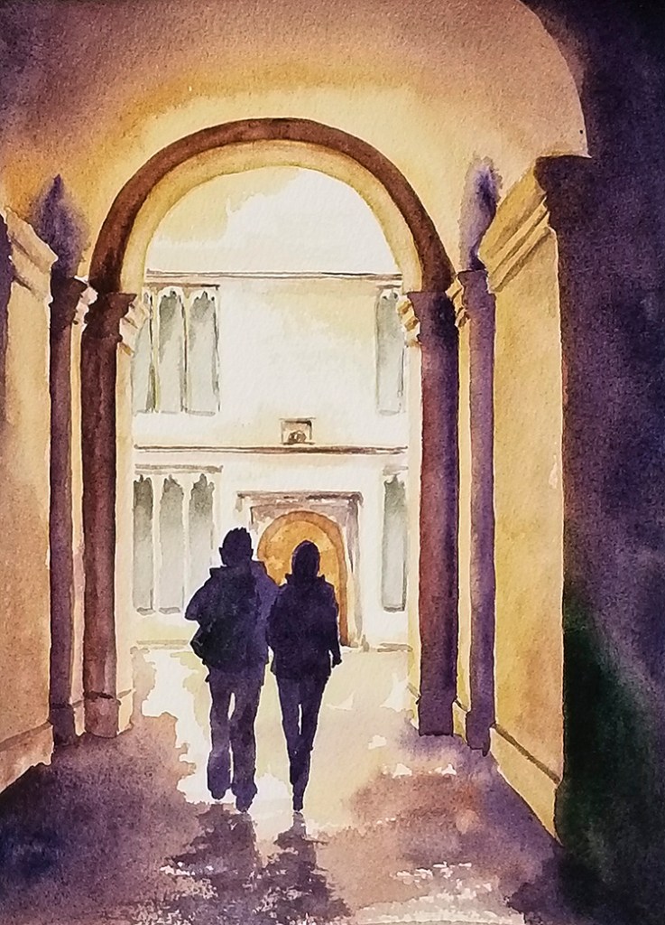
It has been a long stretch, folks, and it is time to open the studio again! I have stayed afloat by painting several commissions and plugging away at new work of my own design these past years. My focus has been fresh new work, focusing on light, drawing on a desire for hope and peace for the future. More than twenty paintings that have never been shown (including the ones pictured above) will be exhibited at my Open Studio in October of 2021.
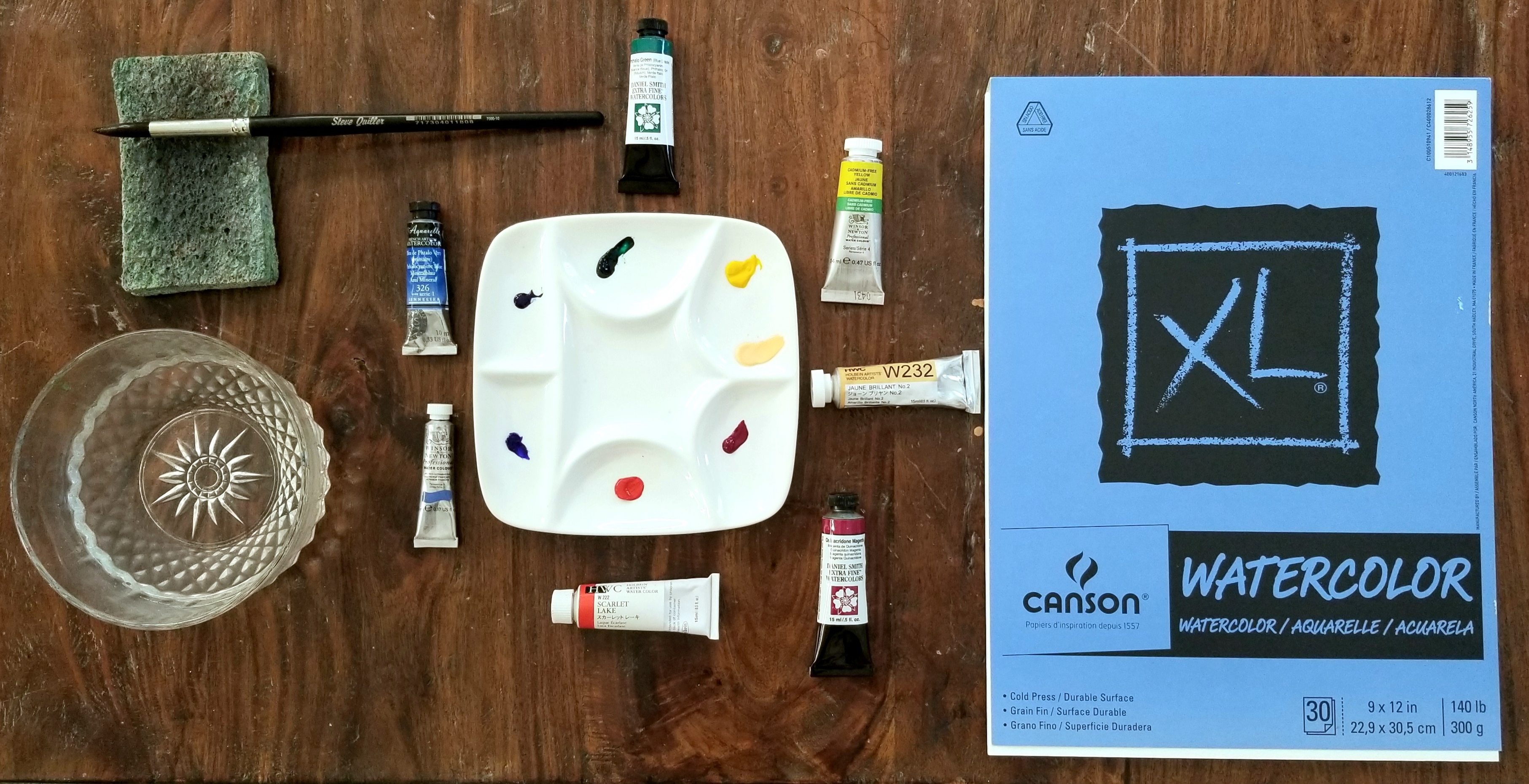
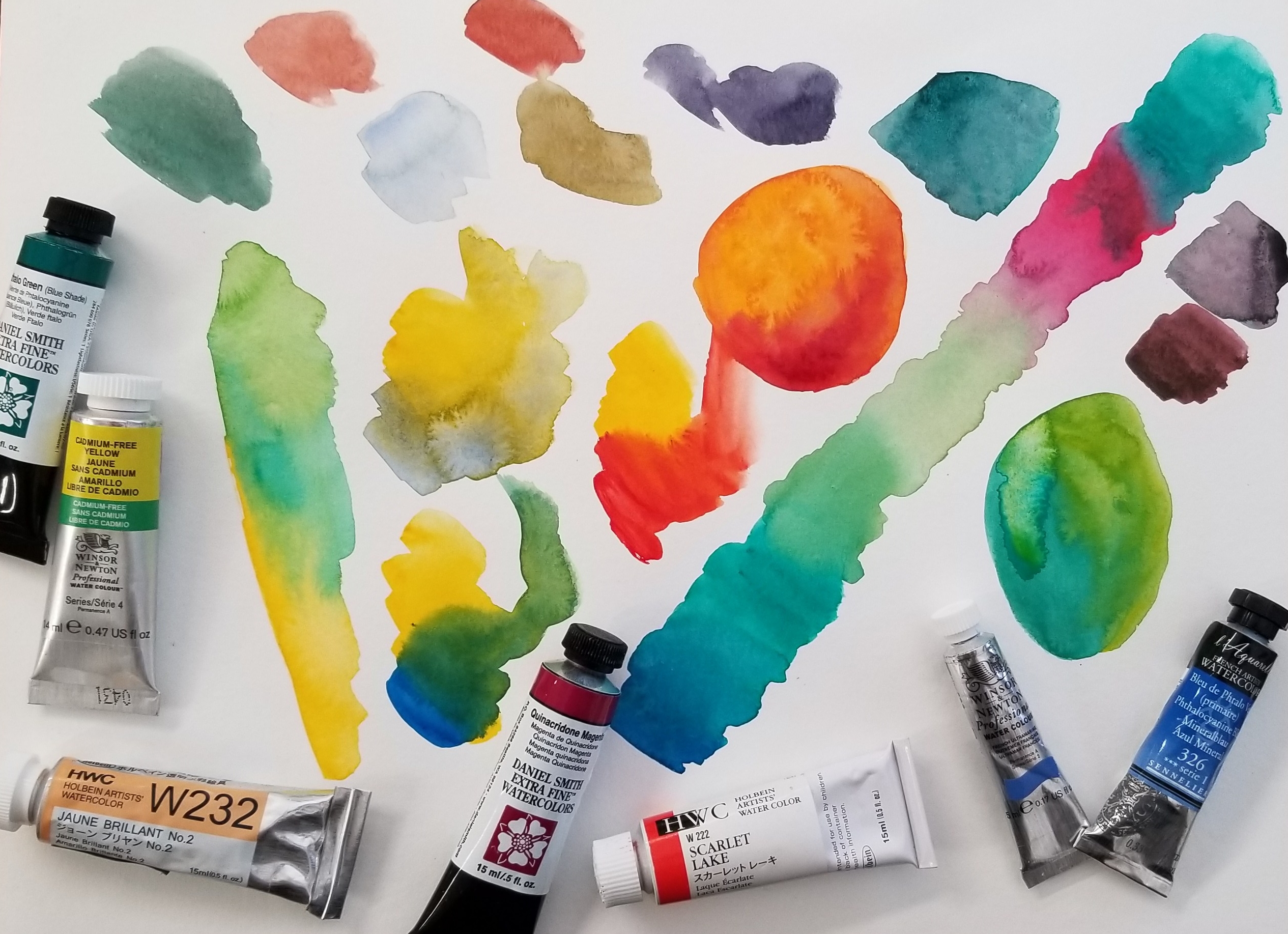
It is like a times tables chart – but for color! I will be using seven colors to make a chart with 35 different color options. Of course, you can make even more variations depending on the ratio you use in each color combination – or if you mix more than two colors together.
To start, I used a sheet of Canson XL Watercolor Cold Press 140 paper with an 8″ x 8″ grid penciled on. This paper is perfect for students and practicing as it is not too expensive. For your own chart, just use whatever cheaper watercolor paper you have around. Save your good stuff for a nice painting.
Here is the video:
The colors I am using are:
Holbein – Scarlet Lake and Juane Brilliant No. 2 Sennelier – Phthalo Blue Winsor & Newton – French Ultramarine and Cadmium Free Yellow Daniel Smith – Quinacridone Magenta and Phthalo Green
I love all these brands (and M Graham, which I didn’t use in this post). Some colors are only available in one brand or they have a particular way of producing it which brings about different results. They are all very high quality and worth the price. However, more expensive doesn’t necessarily equal better. Some paints are more expensive due to country of origin and import cost.
Watercolor is all about water! Too much, not enough, water on the paper, water in the brush, water in the paint, dirty water – even water in the air! Practice awareness and control of water and your watercolor painting will improve.
How much water is on your palette? Is your paint dry? Freshly squeezed from a tube? Wet from use?
How much water is on your brush? Dry? Just dipped in water? Tapped on the edge of your water container? Squeezed? Sponged? Dripping?
How much water is on your paper? Dry? Just painted on? Slightly damp? A pool of water? Soaked through? A bit shiny?
How much water is in the air? Are you indoors or out? Humid day? Dry day? Is a fan or wind blowing on you? An evaporative cooler? Dehumidifier? These factors will effect the speed at which your painting dries out – and how quickly you must paint for certain techniques.
Is your water dirty? If your water is a murky mud color your bright yellow may not pop. The water cannot get cleaner than itself and will transfer – slightly – through your brush to your other colors. Not super sensitive, but keep an eye on this. Frequency of water changes vary with the colors being used. I usually change my water out a couple of times during a painting session. I like to dump it on my plants (if painting with non-toxic paints).
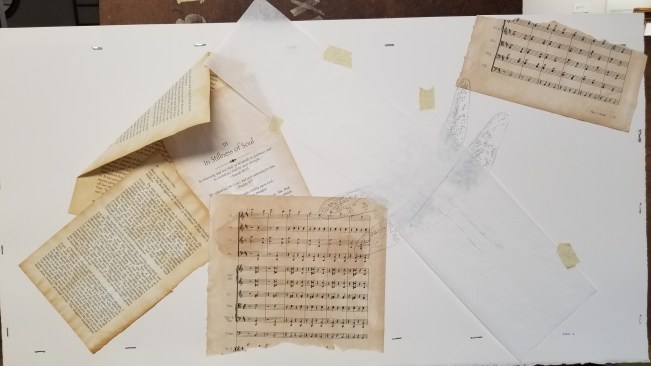
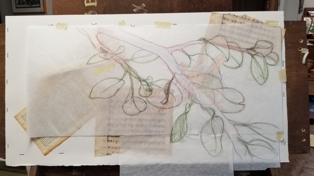
This is how the visible start looks (after my perfectly executed mental painting, of course). I’ve got my book pages down and I’ve drawn my dragonfly. I am trying out a new idea with the pages arranged haphazard – like a gust of wind blowing them away.
I usually have my whole composition decided before I start on the final piece. This time, I kept making decisions and changes as I drew! I didn’t want to damage the watercolor paper with multiple drawings and erasing, so I used tracing paper to sketch and then transferred the final lines onto the watercolor paper. For this painting, I placed the dragonfly first, then made the eucalyptus branches work around it.
Paint!
Laying down some background color…
Painting, painting, painting…
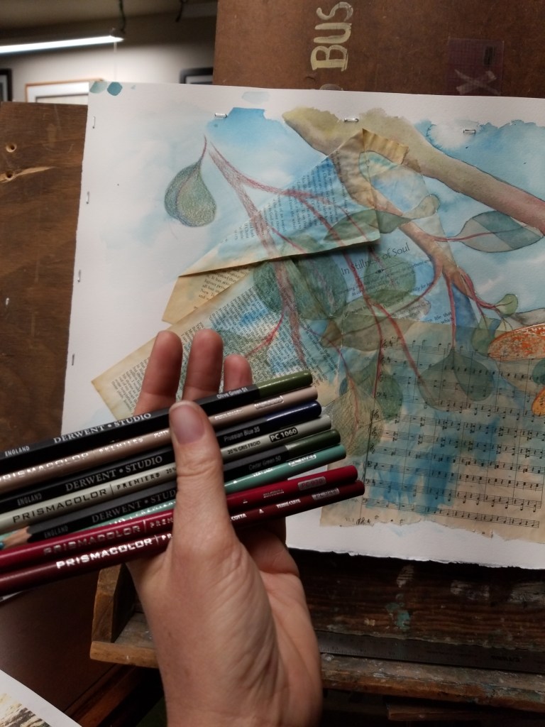
Some definition and texture using Prismacolor and Derwent colored pencils.On the easel but ready for framing!
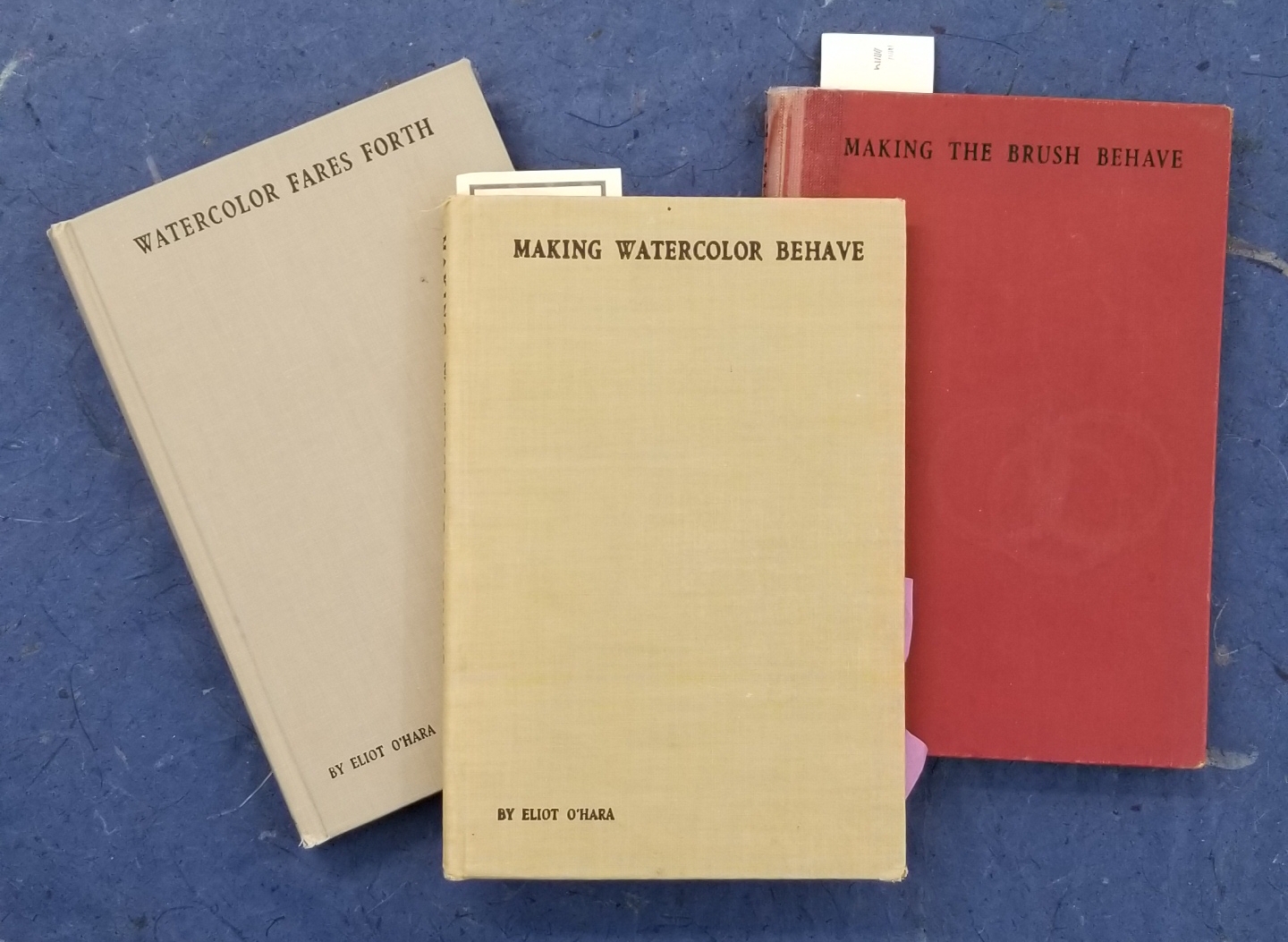
I don’t know about you, but I love old books. When the vintage typography, and beautiful language combine with engaging and informative writing my brain lights up. And if that subject is art? I just can’t resist. Just such a winning combo is found in these three books by Eliot O’Hara from early 1900’s: Watercolor Fares Forth, Making Watercolor Behave, Making the Brush Behave.
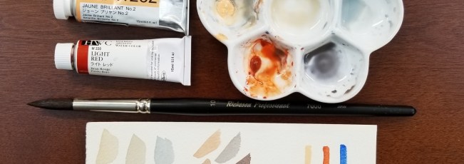
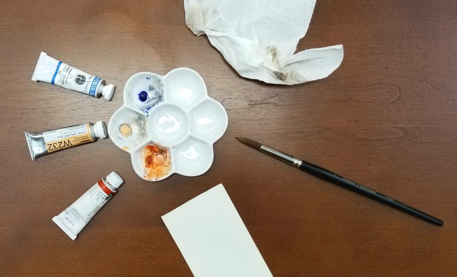
Here is what I use to make one of my favorite grays – and some other lovely neutral colors: Ultramarine (Green Shade), Jaune Brilliant No. 2, and Light Red. I am using Da Vinci and Holbein watercolor paints here, but you can use a different brand or a student grade paint or even a similar color combination from a Crayola watercolor set!
I like to have a little porcelain palette for mixing special color combinations like this. It keeps my main palette more organized and clean.
I’ve squeezed a tiny bit of each color into their own wells in my mini palette. Add water and transfer just a bit of the Ultramarine (blue) and Juane Brilliant (peachy-cream) into a new well. Playing with the pigment ratios I can create a whole new array of gray tones! (You can see just five variations to the left of the paper pictured below). If I want a darker, warmer option, I can do the same process with the Light Red (seen with the angular swatches to the right in the photo below).
This is a really fun exercise to try and see how many different colors you can make from just these two or three base paints. Once you become familiar with the types of neutral colors you can create, you can go back to that color for a painting. Just mix up a big batch in a fresh well!