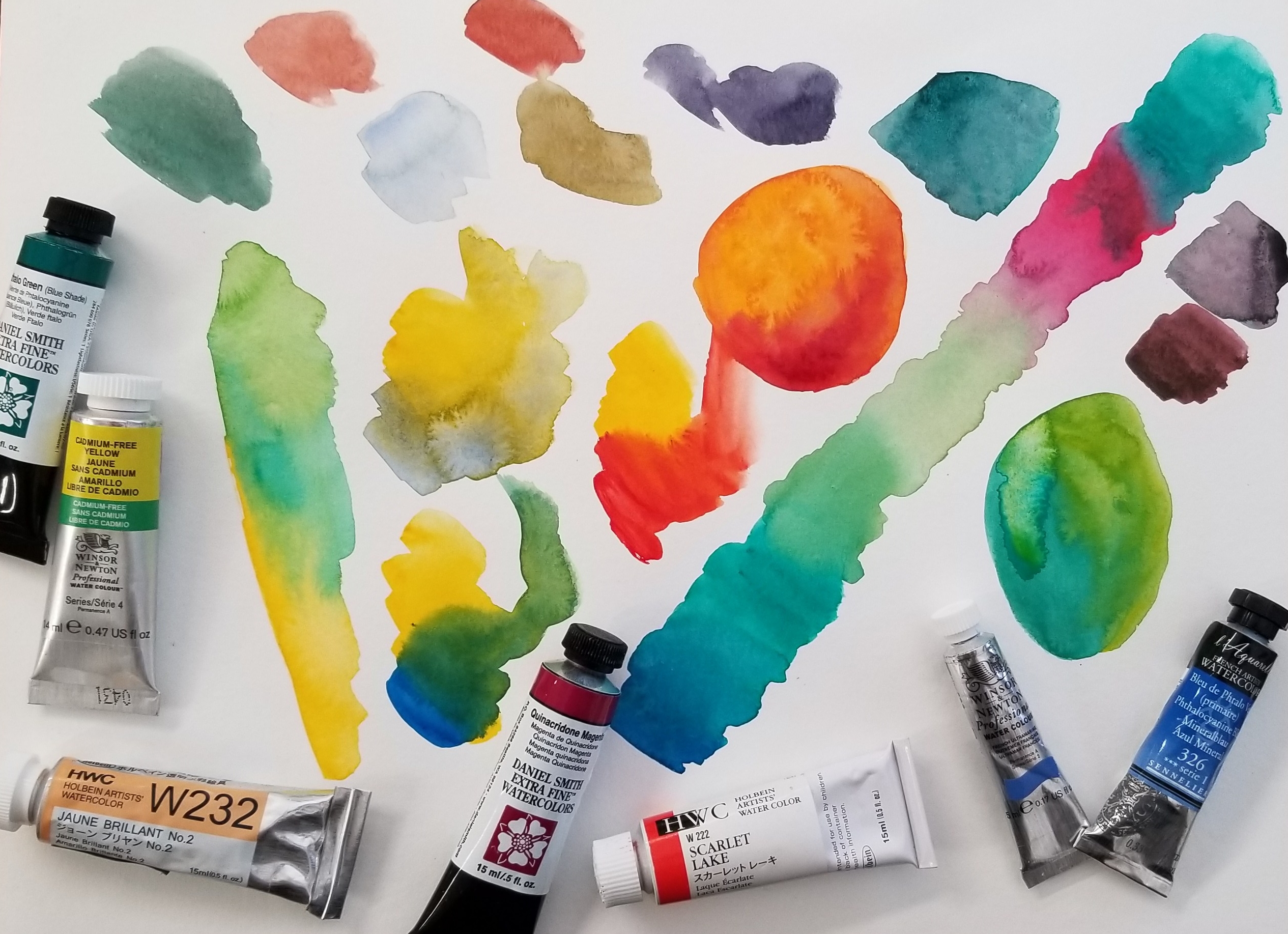
It is like a times tables chart – but for color! I will be using seven colors to make a chart with 35 different color options. Of course, you can make even more variations depending on the ratio you use in each color combination – or if you mix more than two colors together.
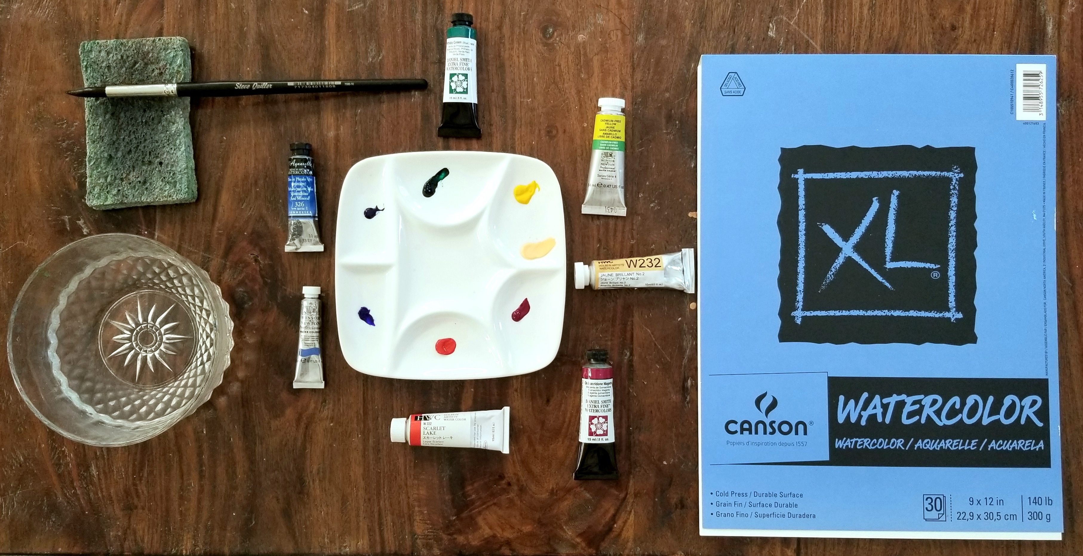
To start, I used a sheet of Canson XL Watercolor Cold Press 140 paper with an 8″ x 8″ grid penciled on. This paper is perfect for students and practicing as it is not too expensive. For your own chart, just use whatever cheaper watercolor paper you have around. Save your good stuff for a nice painting.
Here is the video:
The colors I am using are:
Holbein – Scarlet Lake and Juane Brilliant No. 2
Sennelier – Phthalo Blue
Winsor & Newton – French Ultramarine and Cadmium Free Yellow
Daniel Smith – Quinacridone Magenta and Phthalo Green
I love all these brands (and M Graham, which I didn’t use in this post). Some colors are only available in one brand or they have a particular way of producing it which brings about different results. They are all very high quality and worth the price. However, more expensive doesn’t necessarily equal better. Some paints are more expensive due to country of origin and import cost.