It was the best of times, it was the…well, a mediocre time. Great because I was painting. Less than great because it didn’t turn out remotely as good as I had hoped.
I am working on painting glowing light. I am a generally serious and restrained person – kind of the opposite of colorful and lighthearted. These last two years have been heavy enough without me pulling myself down any further. So this year I am focusing on joy in my life. I hope to start showing you more paintings which radiate hope and joy.
I have learned a lot during the era of Covid. One thing is that, although I do best actually creating my artwork in solitude, my work truly thrives when I have the opportunity to present it to others. I need that feedback which is only present in person, watching people react to and make connections through my paintings.
I have long been an advocate of visiting galleries and art museums. There is no comparison to standing in front of the actual painting only an arm’s reach away. No matter how high quality a reproduction is, it is not the real thing made by the artist and seen by your own eyes. This is such a priority to me that I have built international trips around the artwork I can experience and share with my family. Can I tell you about one of those experiences?
As a child, my mother would often read to me and my siblings about art and artists. One painting stands out in my mind (partly) for silly reasons. Primavera(Spring) by Botticelli is masterwork depicting mythological figures and is heavy with symbolism. My mom was showing me and my brother a picture of the painting in a book and pointing out different elements. She mentioned the “angel hoovering above” at which we broke into unstoppable giggles. Hoovering, not hovering. You know, cupids are not usually depicted as vacuuming the air above Venus! This was then a family joke for years. Fast forward to my first trip to Florence, Italy and The Uffizi. Wandering through halls of art and then stepping into a room with a huge, wall sized painting: Botticelli’s Primavera. I was breathless at the experience. This painting, so small in a book on my mother’s lap, is massive. I cried and laughed out loud – in public! There were certainly connections to my mom (also an artist), my childhood art appreciation (books and museums), my college art history studies (slides!) and the sheer, enveloping experience of standing in front of that painting in Florence.
I could keep going. I have been to twenty world class art galleries in half a dozen countries. I have experiences with art which are priceless and I will always cherish. I am pleased to have shared most of those experiences with my husband and now many with my children as well. I have seen art works capture the attention of my children at young ages, how they will pause and ponder over a painting. How they will bring up memories of particular paintings they have seen in galleries, how they feel about them, how something else they are experiencing makes them feel and reminds them of the painting.
We humans are made to experience with our senses. The digital world will never eclipse real experiences. Twitter is inferior to books. Virtual is less ideal than physical. People need people. The introvert that I am has been hit a little too hard with that lesson this past year and a half (going on two).
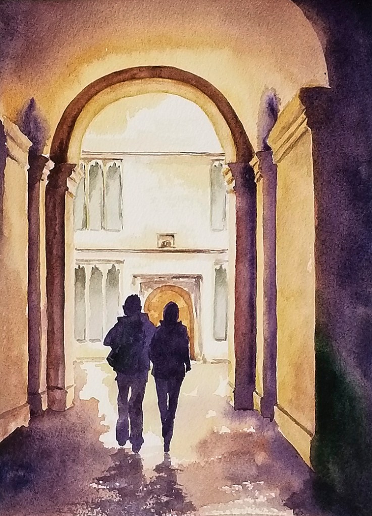
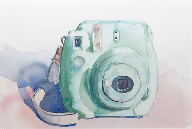
It has been a long stretch, folks, and it is time to open the studio again! I have stayed afloat by painting several commissions and plugging away at new work of my own design these past years. My focus has been fresh new work, focusing on light, drawing on a desire for hope and peace for the future. More than twenty paintings that have never been shown (including the ones pictured above) will be exhibited at my Open Studio in October of 2021.
Finally hitting that “delete account” button was really hard. I was kind of mad at myself for finding it difficult. I mean, I’d been toying with the idea of deleting my social media accounts on and off for years. Every time I would read an article about how bad social media is for your creativity, concentration, patience, peace of mind, etc. I would have renewed intentions of kicking the habit. But I just didn’t. I would flex my self-control instead. I’d take a break. I’d use a time monitoring app to help me keep track and break the scroll habit. But I still found I was spending hours on my phone.
I don’t have hours to spare! Where was this time coming from?
Well, from my kids for starters. I would take little phone vacations when feeling stressed. But the mini-escapes never felt refreshing. Instead of actually giving my brain a little peace, I was just filling it up with more noise. I wasn’t letting my brain work on creative solutions in those little moments between. I would fill the voids with information opioid. You know, because it is sooo helpful to read all 200 comments on a stranger’s post.
So I have taken Facebook and Instagram out of my life.
It
Feels
Great
Time did not magically increase for me. I still don’t get as much done as I would like in a given day. I still have limited time to work. I mean, I still have four little kids.
However, in the first few days after I got rid of my social media accounts I felt more clear-headed. I picked up my phone just as much, but I put it back down right away because my insta-fix was gone. And really, checking my email wasn’t nearly as compelling as a social media feed. I started to have more patience with my kids. I started to speak in more coherent sentences with better vocabulary. I started being able to focus on my reading right away instead of with a little lag while my brain got used to processing printed words instead of scrolling images and statuses begging for reactions and instant gratification. I am spending more time reading to my kids again. I am able to make it through their school day with a little more grace. I am finding mental energy to say yes to more meaningful interactions and projects. I even finished a painting that had been sitting unfinished for months!
So I am definitely sticking with the non-social media lifestyle for a while.
Maybe when my baby isn’t a baby anymore I’ll be able to carve out some time and use it as a tool instead of a stress-inducing distraction. Until then, I have big plans for this site! I want to get a lot more tutorials up and make more process videos. I want to offer encouragement for my readers to be creative and cultivate the moments of beauty in your life. I want to improve my own painting practice. I have some very specific goals for my artwork and a brand new series of paintings in the works. I have built some new skills to branch out my artwork into new product areas. I am working on cool, insider content. So. Many. Ideas.
In this lesson, we will be using willow charcoal sticks to create a value scale and value study. These little sketches are a great way to prepare for a more complete drawing and explore the different ways light and shadow can effect your drawing.
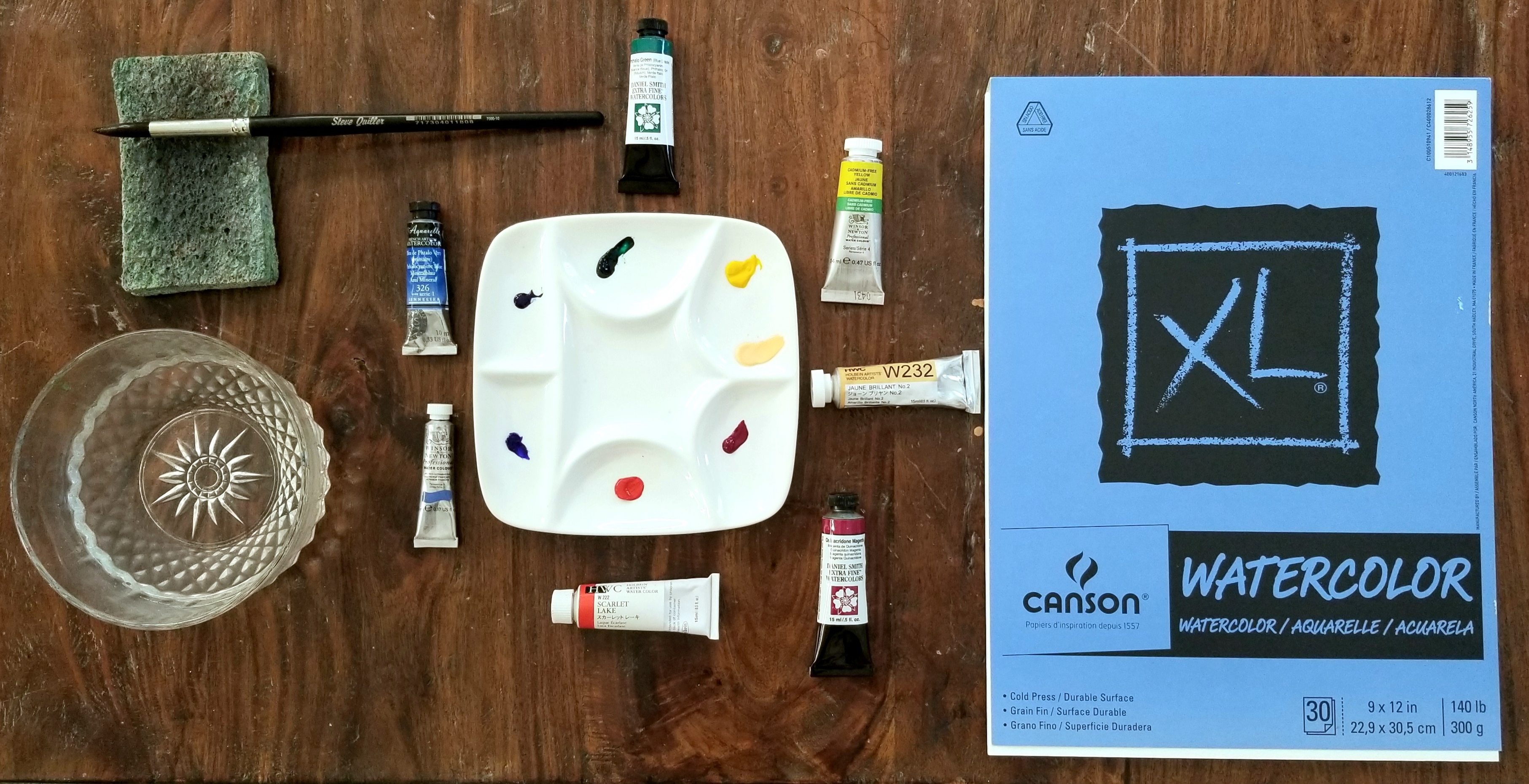
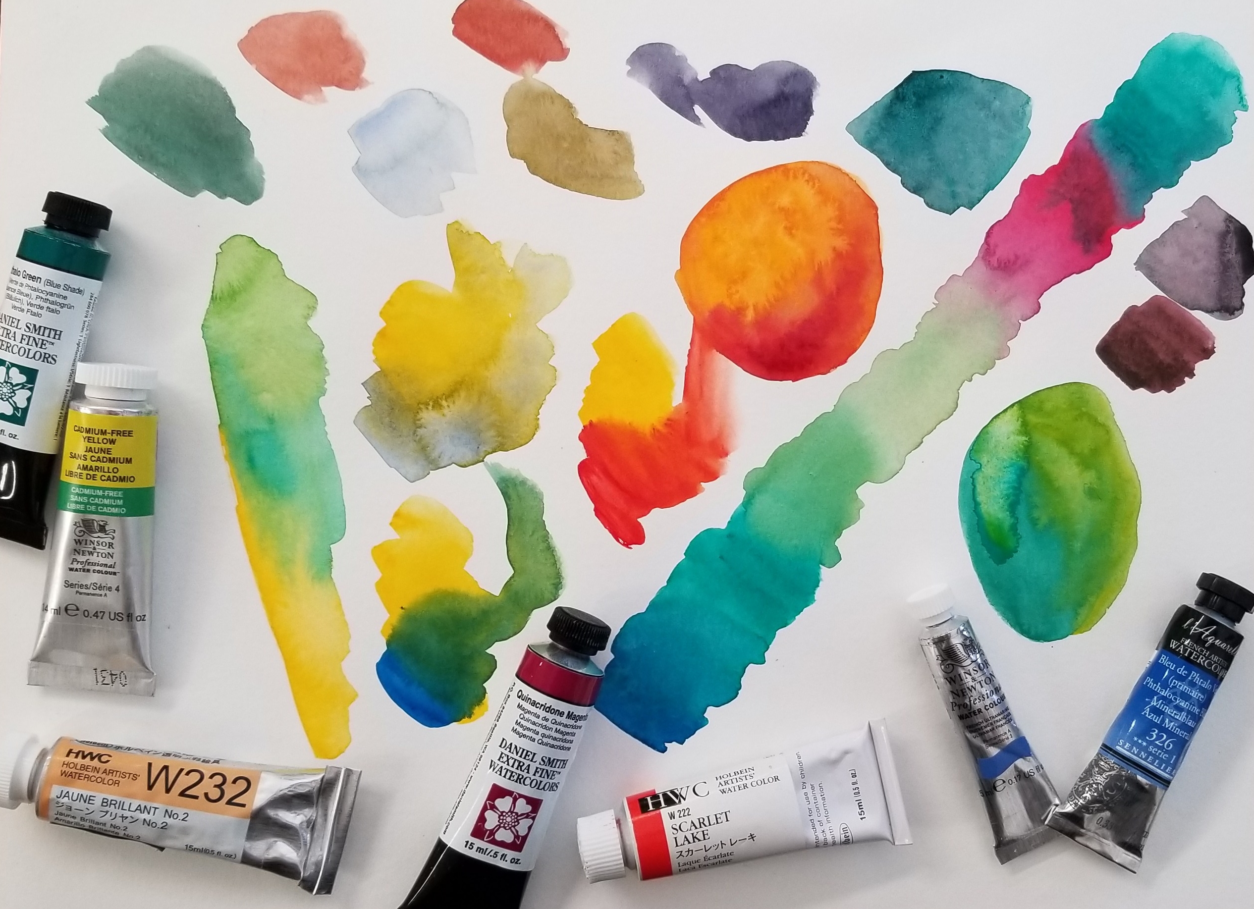
It is like a times tables chart – but for color! I will be using seven colors to make a chart with 35 different color options. Of course, you can make even more variations depending on the ratio you use in each color combination – or if you mix more than two colors together.
To start, I used a sheet of Canson XL Watercolor Cold Press 140 paper with an 8″ x 8″ grid penciled on. This paper is perfect for students and practicing as it is not too expensive. For your own chart, just use whatever cheaper watercolor paper you have around. Save your good stuff for a nice painting.
Here is the video:
The colors I am using are:
Holbein – Scarlet Lake and Juane Brilliant No. 2 Sennelier – Phthalo Blue Winsor & Newton – French Ultramarine and Cadmium Free Yellow Daniel Smith – Quinacridone Magenta and Phthalo Green
I love all these brands (and M Graham, which I didn’t use in this post). Some colors are only available in one brand or they have a particular way of producing it which brings about different results. They are all very high quality and worth the price. However, more expensive doesn’t necessarily equal better. Some paints are more expensive due to country of origin and import cost.
In this video I am demonstrating sketching using a centerline and restated lines. A centerline helps with checking your symmetry on an object like the glass bottle. You can measure each side to make sure they are equal and that the narrow bottleneck is evenly drawn. You will not leave a centerline visible in a finished drawing, but it is a great tool for your practice.
“Restated lines” is a phrase describing the sketching style. You don’t use an eraser. Instead, when you make a mark which isn’t correct, you just draw right over it. It’s okay if you make several marks. Your goal is to get more accurate with each stroke you make, without taking the time to stop and erase each mistake. This maximizes your drawing practice and keeps you in the flow of observation and positive drawing instead of negative analysis and erasing.
Next up in drawing I’ll tackle a more difficult subject…
Watercolor is all about water! Too much, not enough, water on the paper, water in the brush, water in the paint, dirty water – even water in the air! Practice awareness and control of water and your watercolor painting will improve.
How much water is on your palette? Is your paint dry? Freshly squeezed from a tube? Wet from use?
How much water is on your brush? Dry? Just dipped in water? Tapped on the edge of your water container? Squeezed? Sponged? Dripping?
How much water is on your paper? Dry? Just painted on? Slightly damp? A pool of water? Soaked through? A bit shiny?
How much water is in the air? Are you indoors or out? Humid day? Dry day? Is a fan or wind blowing on you? An evaporative cooler? Dehumidifier? These factors will effect the speed at which your painting dries out – and how quickly you must paint for certain techniques.
Is your water dirty? If your water is a murky mud color your bright yellow may not pop. The water cannot get cleaner than itself and will transfer – slightly – through your brush to your other colors. Not super sensitive, but keep an eye on this. Frequency of water changes vary with the colors being used. I usually change my water out a couple of times during a painting session. I like to dump it on my plants (if painting with non-toxic paints).
In this video we will be doing a blind contour drawing. You will need a pencil, paper, drawing board and clip (optional, but a good thing to have anyway), paper plate, and an object to look at and draw.
Your object should have an interesting outline with some curves, bumps, or some variety in shape. A teapot, vase of flowers, lamp, binoculars, or hat would all work great depending on how much time you want to spend and how much of a challenge you are up for.
So what is a blind contour drawing? First, a contour drawing is a line drawing in which you will carefully draw the outside shape of an object. But we will be doing this contour drawing blind – that is, not looking at our paper! To make sure we cannot accidentally look, we will use a paper plate to block our view.
This exercise helps build observational skills and attention to detail.
Push your pencil through the plate and let the plate rest on top of your hand. You can look to make sure you start your drawing in a good position on your paper, but then don’t look down again until you are finished.
Choose your starting point and slowly, slowly move your eyes and pencil along at the same speed. Inch your way along the drawing as though you were a tiny bug crawling along the contour (outside shape) of your object. Go slow so you can observe every little bump and curve of the object.
Once you have completed your drawing, take a look! Sometimes the lines actually connect, but usually it is a pretty funny looking drawing. That doesn’t matter! What you are doing is developing careful observation. You are training your hand to copy what your eyes see. What you want to see is every change in the shape of your object, but it doesn’t really matter if it is in the right place for this exercise.
Now try it again with a few more objects and see if you have observed every detail possible. Challenge yourself with harder shapes or ease back and do something more simple. Once you have made a few blind contour drawings, choose one of the objects to draw while looking. Try a contour drawing where you are going for an accurate outline.
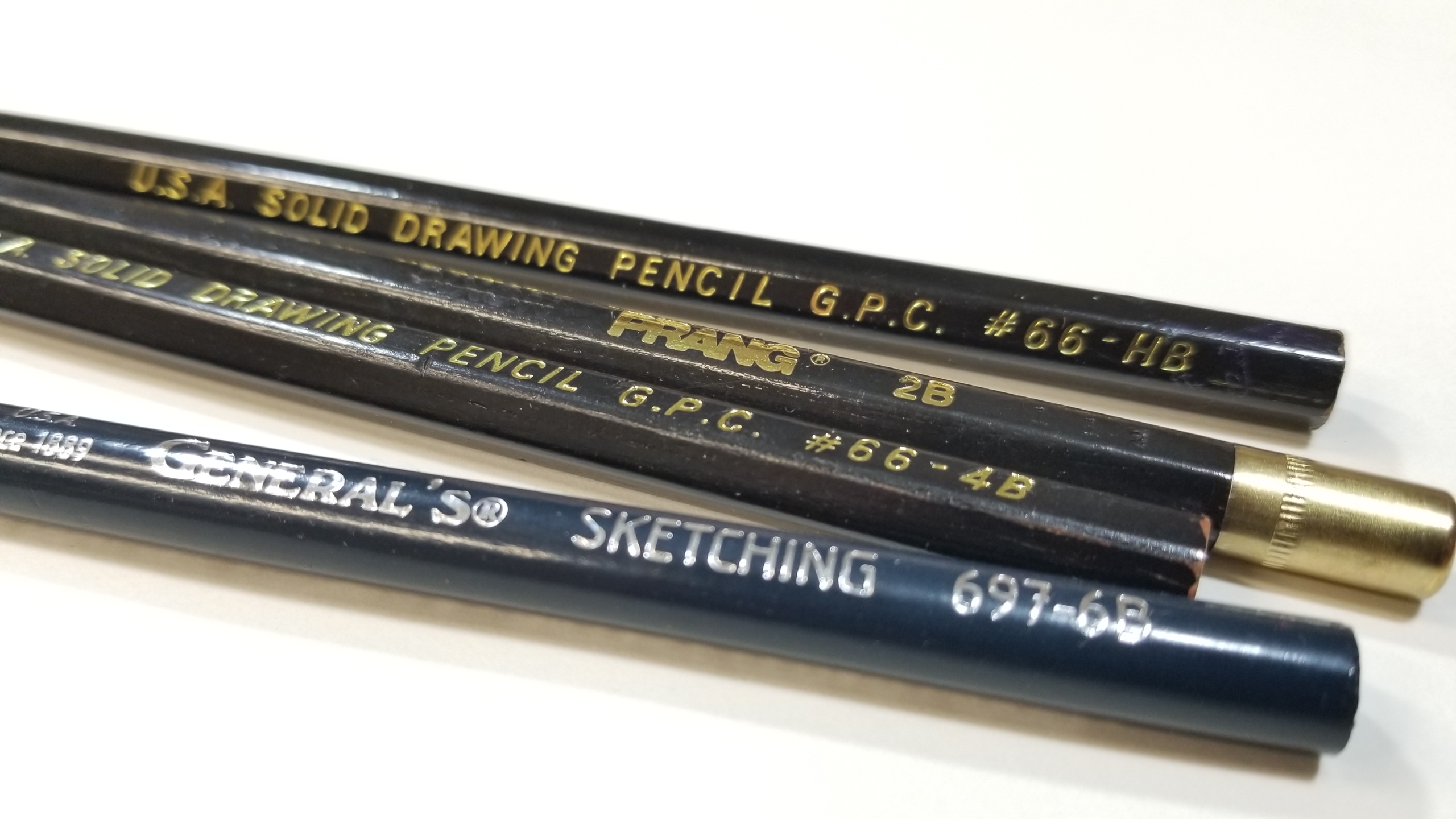
Here are some basic tools to get you started sketching. Brand quality isn’t super important in your sketching pencils. I use a variety with my students, Prang, General’s, Blick – whatever is convenient and on sale when I need to replenish my studio supply. What you do want is a few different lead types. For the most part, you can get all you need done with just an HB, 2B, 4B, and 6B. (We’ll talk more about those below.) Sets will usually come with a nice range, so you don’t really have to put too much thought into which ones to get to start out. You may want to later experiment with more variety like F and H. But I’m getting ahead of myself again, we’ll get to pencil lead at the end.
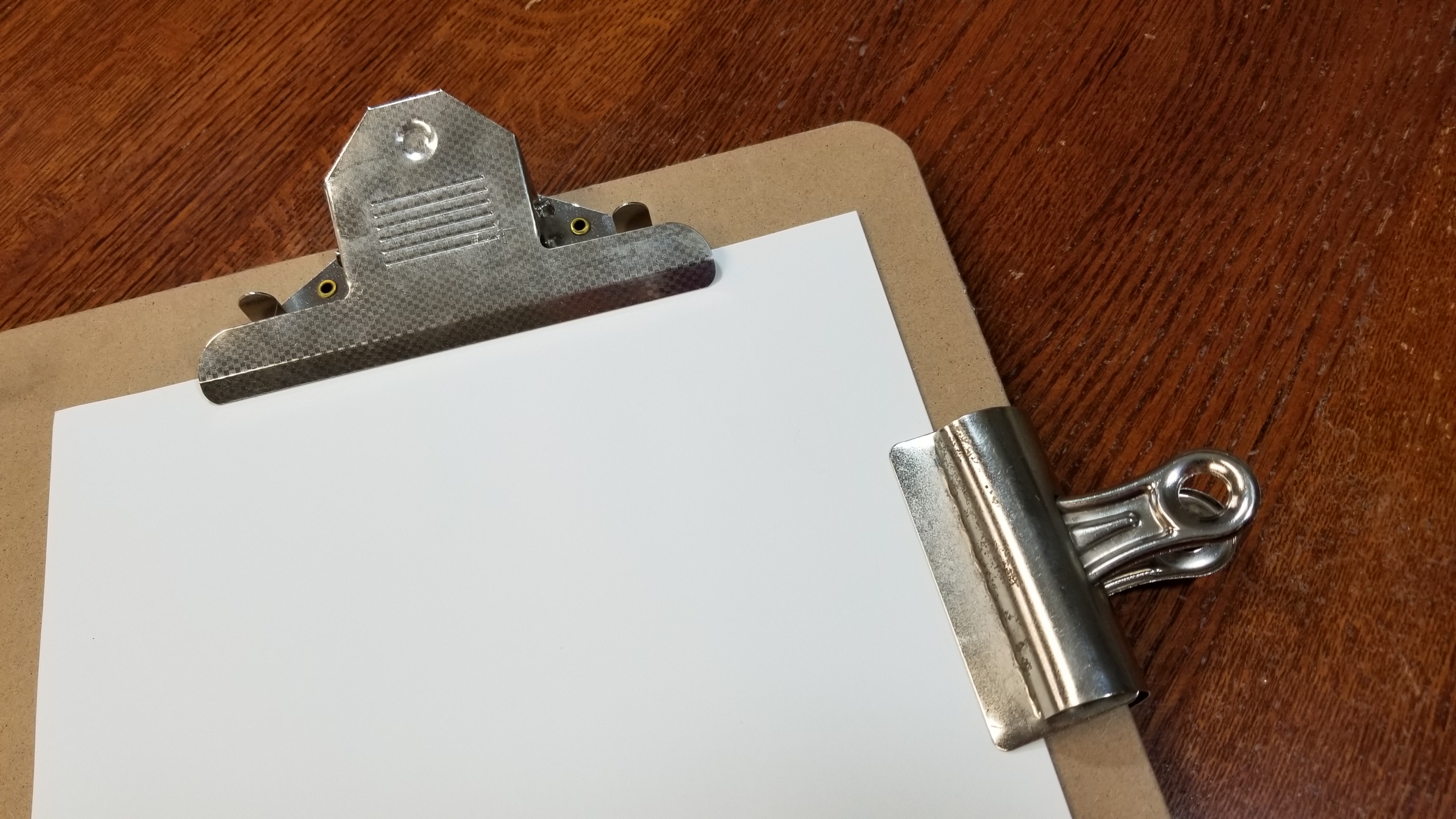
Don’t skip on the drawing board purchase! I know you might have a nice, smooth table to draw on but you still need a drawing board. Why? Because of perspective. When you draw flat on a table you are looking at your paper at a fairly sharp angle, then you hold up your picture (or put it on the wall) and the viewpoint is suddenly shifted. You can end up with a lot of distortion which is not a problem with your skill but with your position.
Below is an 18″ x 24″ drawing board with attached clips (it also has a handle cutout). You can also build your own with a piece of masonite from a home improvement store and a couple of bulldog clips. (You can see a 3″ bulldog clip in the image below.)
You’ll want a nice, smooth eraser too. Test it out to make sure it doesn’t leave behind any smudges or tear the paper.
I also like to use a big mop brush for flicking off the eraser crumbs. This is the best way to clean off your paper without risking any damage to a delicate drawing. If you brush off the eraser remains with your hand you may smudge your drawing and if you blow it off, well, it might get wet.
Now more about the pencils. Pencils are made with a mixture of graphite and clay. The ratio determines how hard or soft the lead is. A 6B pencil is softer and will have more graphite and less clay, a 6H pencil is harder and will have less graphite and more clay. A soft pencil will get you a thicker, darker line while a hard pencil will be thinner and sharper. Pencils on the B side will also be more shiny than the Hs.
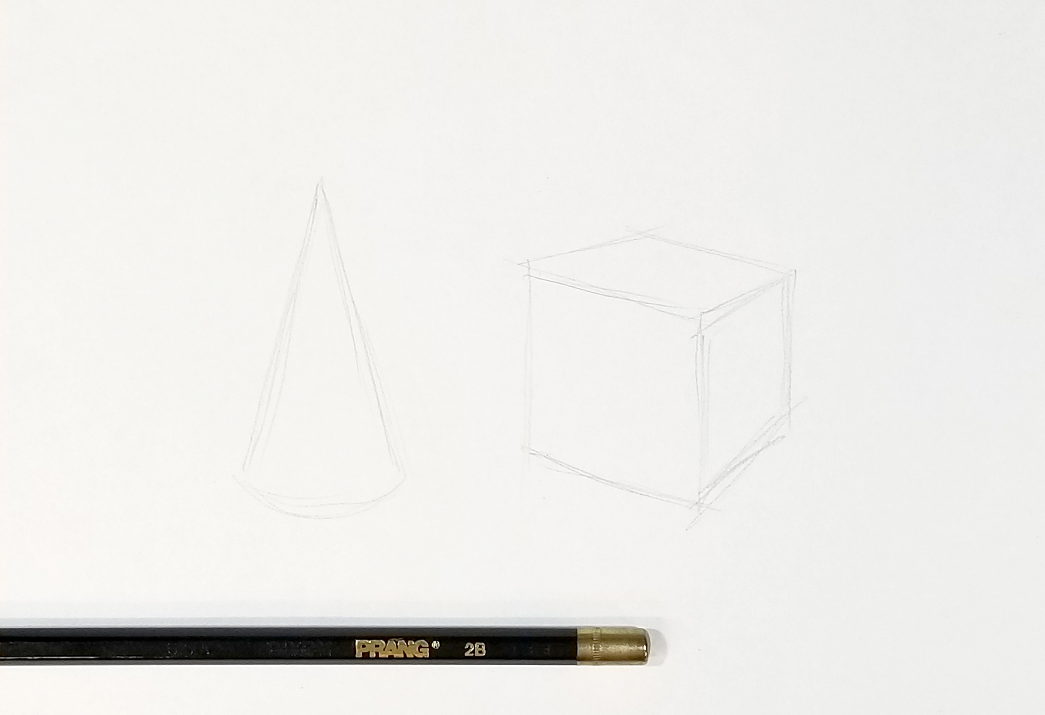
So how do you use these pencils? The quick study below shows how you might use a few of these pencils. First, I sketched out a basic cone and cube shape using the 2B pencil. 2B is easy to erase and light. Works well for laying down some shapes. (I would also use this pencil to start a watercolor painting.)
I switched to the 3B to start building up some mid-toned shadows. I used the 5B and 6B to layer some darker areas. Then I used an HB to draw some light, thin outlines and again the 5B and 6B to build darker shadow tones.
In a refined drawing I would keep going with blending, smoothing, adding layers to darken the darkest areas, and finish the cast shadows.
These tools will help you get started in your drawing practice. Don’t worry about what brands you are using as you are just starting out, just draw, draw, draw!
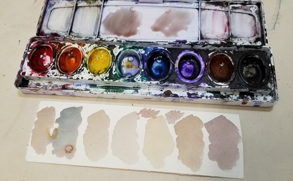
Yes, you can use a cheap watercolor set and still make beautiful paintings! In this post I will show you just a couple of neutral colors you can mix that would work great in a nature painting.
I am using a set my kids have used just to show how you can use what you’ve got – even if you have to borrow from a preschooler. I did have to clean out the colors a bit since the yellow was that special shade of “toddler has been here.”
Here is a little sample of the colors straight out of the pans. Green is pretty much gone. We can mix some greens from this same set in the next post.
For this post, I’m going to use only the orange, yellow, blue, and purple. Look at those nice, subtle colors. Just perfect for your nature journal!