It was the best of times, it was the…well, a mediocre time. Great because I was painting. Less than great because it didn’t turn out remotely as good as I had hoped.
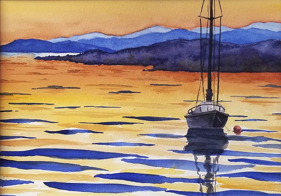
I am working on painting glowing light. I am a generally serious and restrained person – kind of the opposite of colorful and lighthearted. These last two years have been heavy enough without me pulling myself down any further. So this year I am focusing on joy in my life. I hope to start showing you more paintings which radiate hope and joy.
“The pessimist complains about the wind; the optimist expects it to change; the realist adjusts the sails.“
– William Arthur Ward
“I find the great thing in this world is not so much where we stand, as in what direction we are moving – we must sail sometimes with the wind and sometimes against it – but we must sail, and not drift, nor lie at anchor.“ – Oliver Wendell Holmes, Jr
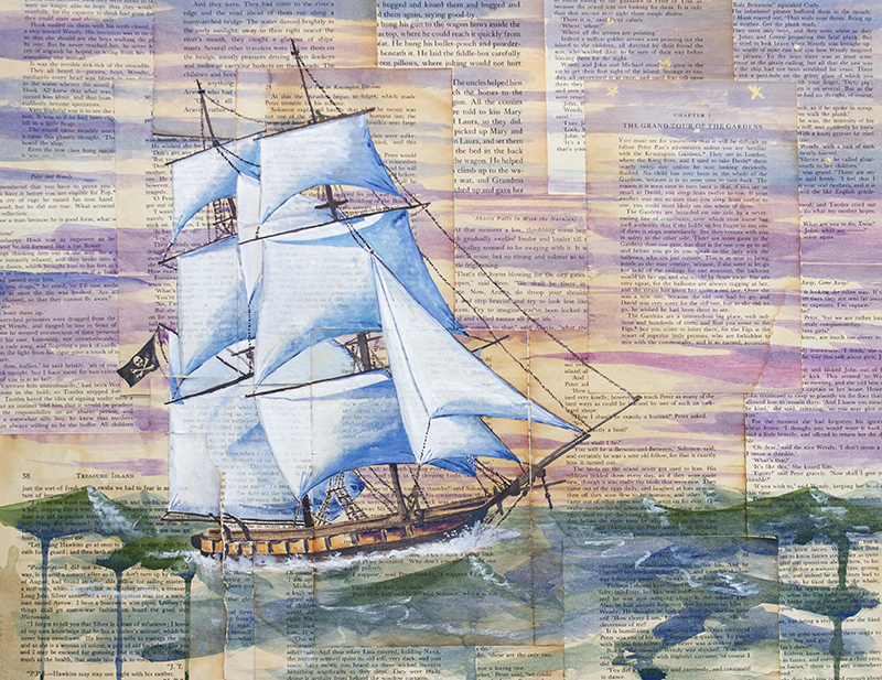
These ship paintings are appropriate for my life right now. I stand on a shore on which I have built a pretty comfortable life. It is hard to leave the familiar, even if the familiar is not working any more. Some big changes are on the horizon for me and my family. Setting sail for new adventures, maybe…
“There is nothing – absolutely nothing – half so much worth doing as simply messing about in boats.“ – The Wind in the Willows, Kenneth Grahame
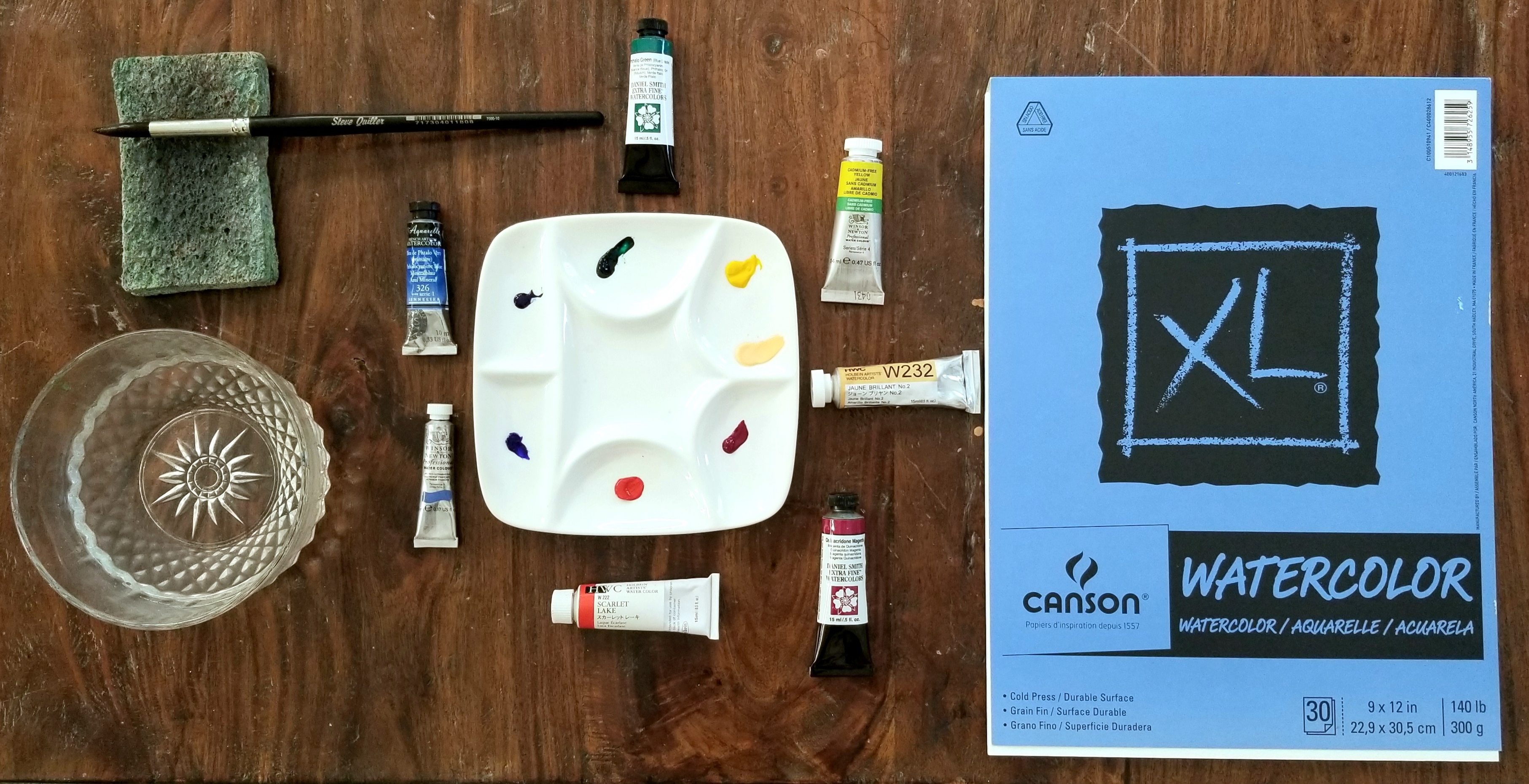
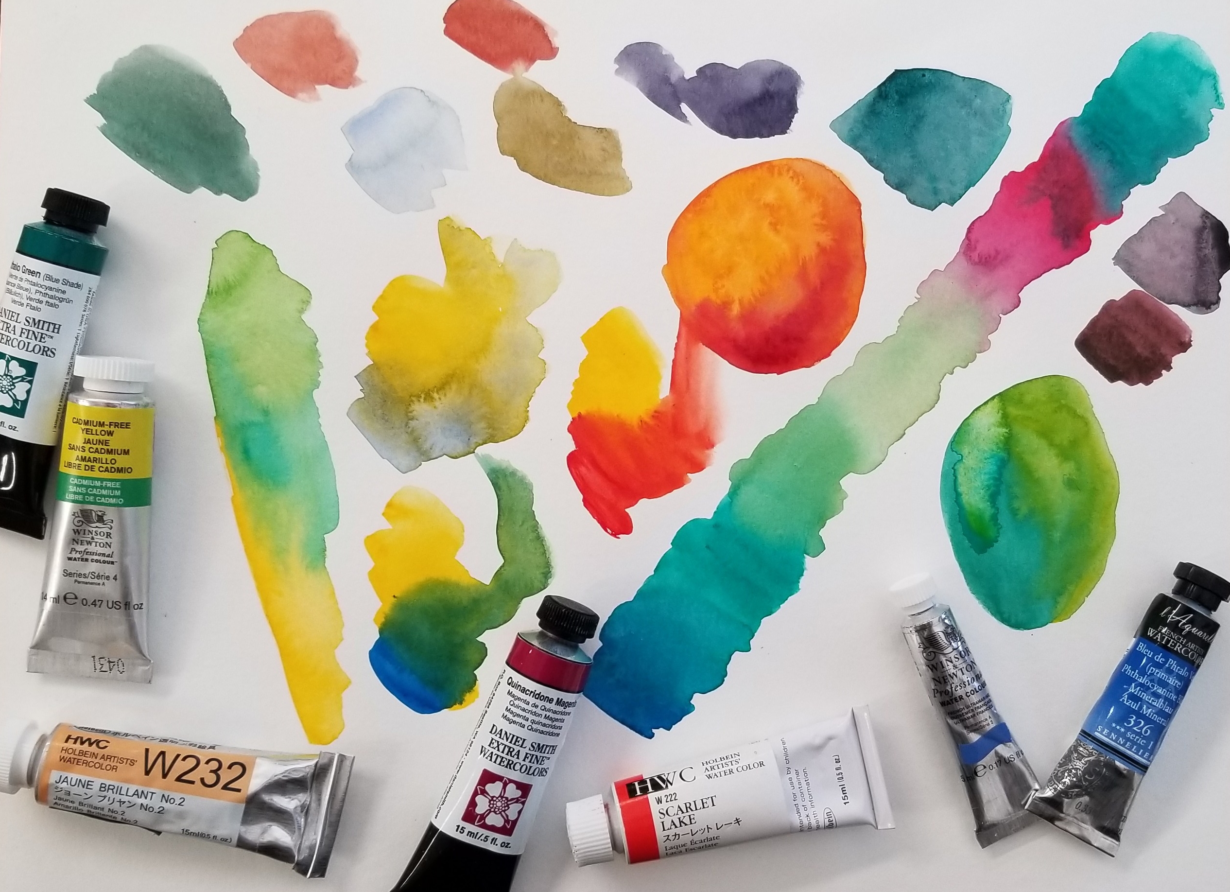
It is like a times tables chart – but for color! I will be using seven colors to make a chart with 35 different color options. Of course, you can make even more variations depending on the ratio you use in each color combination – or if you mix more than two colors together.
To start, I used a sheet of Canson XL Watercolor Cold Press 140 paper with an 8″ x 8″ grid penciled on. This paper is perfect for students and practicing as it is not too expensive. For your own chart, just use whatever cheaper watercolor paper you have around. Save your good stuff for a nice painting.
Here is the video:
The colors I am using are:
Holbein – Scarlet Lake and Juane Brilliant No. 2 Sennelier – Phthalo Blue Winsor & Newton – French Ultramarine and Cadmium Free Yellow Daniel Smith – Quinacridone Magenta and Phthalo Green
I love all these brands (and M Graham, which I didn’t use in this post). Some colors are only available in one brand or they have a particular way of producing it which brings about different results. They are all very high quality and worth the price. However, more expensive doesn’t necessarily equal better. Some paints are more expensive due to country of origin and import cost.
Watercolor is all about water! Too much, not enough, water on the paper, water in the brush, water in the paint, dirty water – even water in the air! Practice awareness and control of water and your watercolor painting will improve.
How much water is on your palette? Is your paint dry? Freshly squeezed from a tube? Wet from use?
How much water is on your brush? Dry? Just dipped in water? Tapped on the edge of your water container? Squeezed? Sponged? Dripping?
How much water is on your paper? Dry? Just painted on? Slightly damp? A pool of water? Soaked through? A bit shiny?
How much water is in the air? Are you indoors or out? Humid day? Dry day? Is a fan or wind blowing on you? An evaporative cooler? Dehumidifier? These factors will effect the speed at which your painting dries out – and how quickly you must paint for certain techniques.
Is your water dirty? If your water is a murky mud color your bright yellow may not pop. The water cannot get cleaner than itself and will transfer – slightly – through your brush to your other colors. Not super sensitive, but keep an eye on this. Frequency of water changes vary with the colors being used. I usually change my water out a couple of times during a painting session. I like to dump it on my plants (if painting with non-toxic paints).